
The first step of any project that involves UX involves researching and sketching. The first manual sketches were digitized for the initial presentation of the proposal from its three profiles -Doctor, Patient and Pharmacy-. We also graphically address the User Flow -user route to complete a task- of each figure and the interactions between them.


The research not only serves to understand the behavior of users -doctors and pharmacists- but also to understand their visual language. With previous branding work, we define the appropriate color palette, as well as the ideal typographic sizes and weights to achieve effective visual communication.


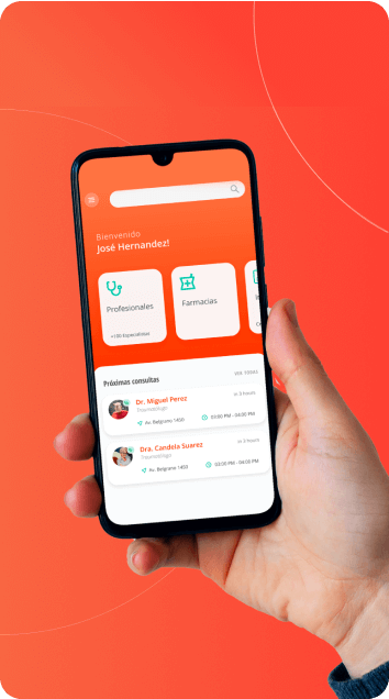
That is why we created a prototype capable of showing the visualization within a real environment, the routes between sections and user interactions.
We developed a landing page -simple web page that seeks to convert prospects- to provide useful information to Innos users: operation of the app, list of benefits and information of interest for each of the profiles -Doctor, Patient and Pharmacy.
To optimize the landing page, the definition of the operation and visualization of the established services and profiles -Doctor, Patient and Pharmacy- was defined. The following advances incorporated the digitization of these definitions and the comprehensive application of the branding strategy.


Innos is synonymous with health, connection and innovation. We designed the graphic symbol inspired by the integration of different profiles in health services.
The figure of the stethoscope seeks to communicate the efficient interaction between patient-doctor-pharmacies.
The work ended with the delivery of a brand manual: construction grid, typography, custom color palette, system, versions, correct and incorrect uses, and more.


Building a community of well-being and health was the premise from social networks. The Innos content grid was designed to provide relevant information to users. From benefits in the app to tech trends in health.


