
blog
Dark Patterns in UX: what they are and why you should avoid them.
In the world of UX design, the focus should always be on improving the user experience, making it clear, direct and accessible. However, there are practices that go against these principles and, although they seem to generate positive results in the short term, they can seriously damage the perception that users have of your brand. We talk about dark patterns or dark patterns in UX.
What are dark patterns in UX?
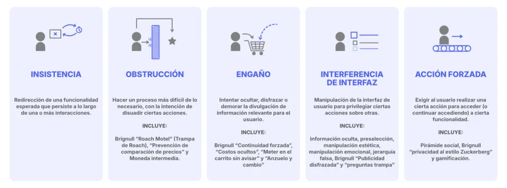
UX dark patterns are deceptive design techniques used to manipulate user behavior. These practices seek to make the user make decisions that perhaps they would not make if they had all the information or options clearly. For example, inadvertently subscribing, purchasing unwanted products, or sharing more data than necessary.
These are bad practices in UX design that take advantage of distraction, haste or cognitive biases to increase conversions. But although they sound effective, the long-term cost is high: user trust is broken and the brand image is damaged. Why is it important to avoid them?
Why is it important to avoid them?
Avoiding dark patterns in UX is not only an ethical issue. Nowadays, users value transparency and honesty. Also:
- Google penalizes misleading sites.
- More and more laws, such as the GDPR in Europe or the Data Protection Law in Latin America, prohibit manipulative practices.
- A user-centered design builds loyalty more than one based on pressure.
Therefore, applying a user-centered and manipulation-free UX is key to the sustainable growth of your website or app.
Common examples of dark patterns
Next, we share the most common dark patterns that you should avoid if you want to improve the user experience:
1. Subscriptions that are difficult to cancel
The classic example where it is easy to subscribe, but almost impossible to unsubscribe. Endless forms, hidden buttons or the need to make a call to cancel.
2. Pre-selected boxes
During an online purchase, some options are checked by default. For example, insurance, donations or extra services that the user did not request.
3. False urgency
Messages like "Only 2 products left!" or "Limited time offer", when in reality the stock is large or the offer is always active.
4. Confirmshaming
Phrases like “No, I prefer to remain poor” when closing a subscription pop-up. They play with the user's guilt to induce an action.
5. Hidden costs
Show an attractive price that increases in the last step of the purchasing process with shipping costs, taxes or surprise commissions.
6. Endless cycles
When you try to close an account and the site redirects you endlessly between sections without ever showing the "Delete account" button.
Best practices for ethical UX:
- Transparency in decisions: the user must understand what they are accepting.
- Accessible design: without hiding buttons or creating confusing routes.
- Clear communication: avoid small print or misleading terms.
- Avoid pressure: if something is for a limited time, it must be real.
- Ease of cancellation: leaving should be as easy as entering.
How does this affect SEO?
From the SEO point of view, dark patterns:
- They increase the bounce rate.
- They reduce the time spent on the site.
- They generate bad reviews, which impact online reputation.
- They can be considered "webspam" practices according to Google's quality guidelines.
Therefore, an honest and clear design is not only better for your users, it also improves your search engine positioning.
At Lab9 we design ethical and effective interfaces. 👉 👉 Let's talk and optimize your website with real strategies that prioritize the user and improve your positioning in Google.